Pattern Matching a Suit: Shirt, Tie and Scale Rules
The surest way to match patterns with a suit is to let only one piece lead, and to make every other pattern differ in scale. Choose the suit first, then the shirt, then the tie. Keep to two patterns at most, and vary their size so that each one reads clearly on its own. A suit cut to your own measurements gives these rules a calm, well-proportioned canvas to work on, which is why we build outfits around the fit first and the pattern second.
TL;DR
- Let one item carry the pattern: a bold suit takes a plain shirt and a quiet tie; a plain suit can take a bolder tie.
- Two patterns sitting side by side must differ in scale, ideally in style as well: small stripes with larger spots, for instance.
- Start with navy and grey, then add dark red, green or purple before you try brighter colours.
- In Singapore’s heat, a breathable wool base and a restrained contrast between pieces look sharper than a loud statement.
- Pattern matching also happens inside the garment: stripes, checks and plaids should meet cleanly at the seams.
Table of Contents
- What pattern matching means
- Start with scale, not with pattern type
- Decide which piece leads
- Suit, shirt and tie pairings that work
- Colour, kept simple
- Texture is the easy upgrade
- Choosing for the occasion
- Pattern matching in Singapore’s climate
- Mistakes to avoid
- How pattern matching works inside the garment
- Our perspective
- Bring it to a suit made for you
- FAQ
- Sources
What pattern matching means
The phrase covers two different things, and both decide whether a suit looks considered.
The first is how you combine patterns across an outfit: the suit, the shirt, the tie and the pocket square. This is the part most men search for, and it is the focus of this guide.
The second is how a tailor lines up the pattern of the cloth across the garment, so that a stripe or check runs unbroken over the jacket’s seams, pockets and collar. You never see it when it is done well, and you notice it at once when it is not. We come to it near the end.
If a term is new to you: scale means the size of a pattern’s repeat (a pencil-thin stripe is small scale, a broad bar stripe is large), and contrast means how far the pattern’s colours stand apart from the background.
Start with scale, not with pattern type
Most advice online tells you which patterns “go together”. The more useful question is how big each pattern is relative to its neighbour.
Permanent Style, a respected menswear publication, recommends sticking to two patterns across suit, shirt and tie. It adds that when two patterns sit next to each other they should differ in size and preferably in style: small stripes with big spots, or a big check with a muted paisley. A pinstripe suit with a polka-dot tie, it notes, needs a plain shirt.
The reasoning is visual. Two patterns of the same size compete for attention, and at conversational distance they blur into a single vibrating surface. Different sizes give the eye a hierarchy: one pattern reads first, the other recedes.
Proximity matters
Gentleman’s Gazette points out that the scale rule bites hardest on pieces lying directly against one another, such as shirt and tie, or jacket and shirt. A pocket square sits apart from the shirt, so it has more freedom, though its pattern should still differ in size from the suit’s.
Loud to soft
In an April 2026 piece on wearing suits in Singapore, The Straits Times quotes Beams creative director Tatsuya Nakamura on clashing patterns: calibrate the volume of the pieces and move from loud to soft, or soft to loud. His own example makes the idea concrete. The tie is his loudest item and also the smallest, the striped shirt tones things down, and the faintly checked heather-grey jacket stays muted. He also observes that Singapore customers tend to prefer a slight difference to major statement pieces, a useful guide to local taste.
Decide which piece leads
A simple way to apply all of this is to treat the suit, shirt and tie as three items and allow only one of them to be bold. This is sometimes called the “one bold, two solids” approach, and it works because it removes decisions.
| If the suit is… | Then the shirt is… | And the tie is… |
|---|---|---|
| Plain or in a subtle weave | Plain white or light blue | Bold: stripe, geometric or paisley |
| Pinstripe or a visible check | Plain, in white or light blue | Simple: a solid or a small, quiet motif |
| Plain, with a patterned shirt | Striped or checked, medium scale | A solid in a dark shade, such as navy |
A dark solid tie is the safe fallback in every one of these combinations. If you are unsure at the mirror, put it on and move on.
Two patterns on the shirt and tie
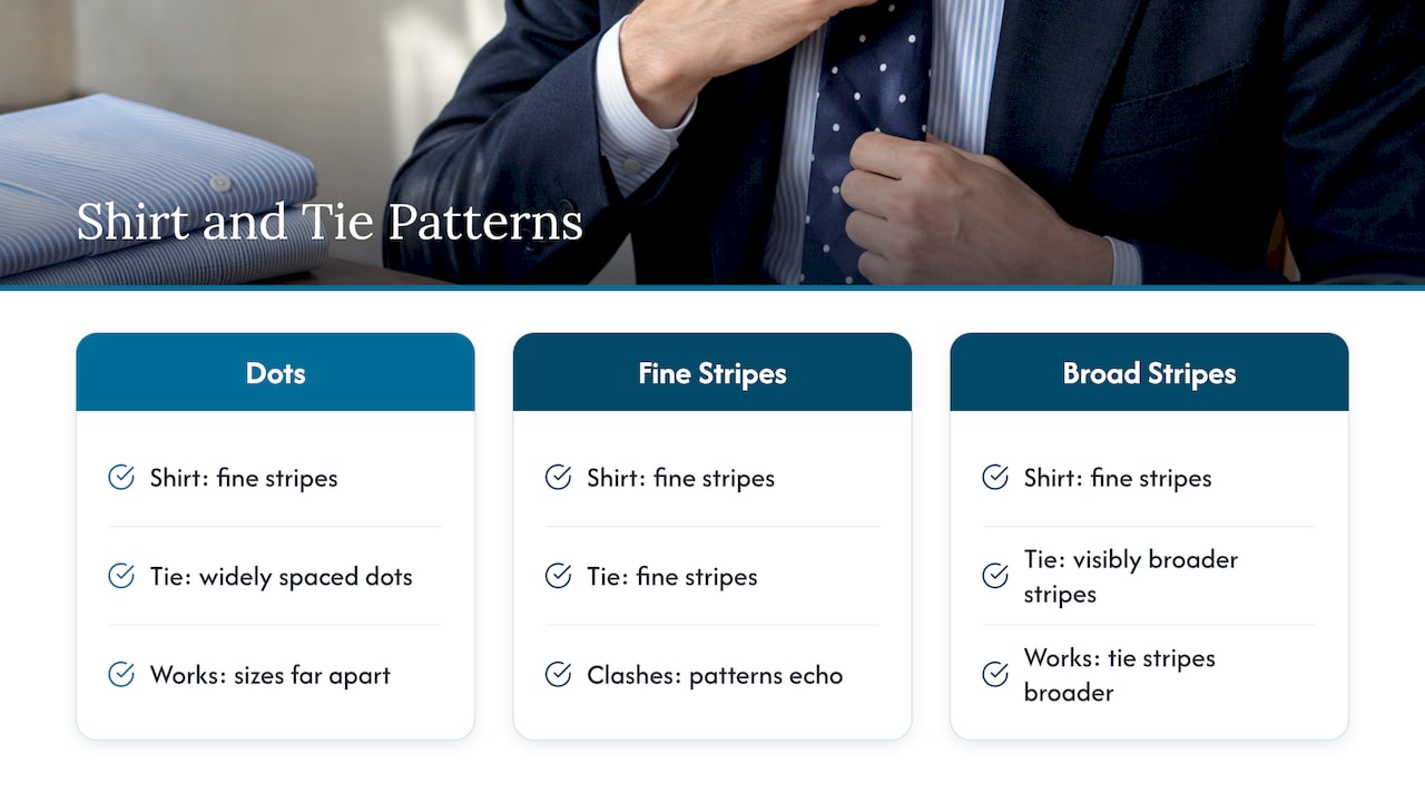
When you want both shirt and tie to carry pattern, keep the suit plain and let the proportions differ. A widely spaced polka dot against a finely striped shirt works, because the two sizes are far apart. A finely striped tie against the same shirt does not, because the stripes echo and collide. Stripes over stripes can work only if the tie’s stripes are visibly broader than the shirt’s.
Three patterns
An outfit with a patterned suit, patterned shirt and patterned tie is possible, but it asks for a trained eye. If you want to try it, keep two of the three at very low contrast, so that from a few steps away they read almost as solids.
Suit, shirt and tie pairings that work
The combinations below are a reliable starting point. They rely on a plain or lightly textured shirt as the backbone and let the tie or suit supply the interest.
| Suit | Shirt | Tie |
|---|---|---|
| Navy, plain | White or light blue | Burgundy or silver, or a small repeating pattern |
| Navy, pinstripe | Plain white | A solid or a very fine geometric |
| Mid-grey, plain | White or pale blue | Navy, burgundy or a broad stripe |
| Charcoal, plain | White or light blue, or a fine stripe | Navy or a bolder paisley |
| Grey, faint check | Fine stripe at a different scale | Solid, or a tiny dot |
| Black, plain | White | Black or a deep burgundy |
The logic holds for tailored garments of any cut. If you want to see how a stripe is handled in a suit made for you, our guide to pinstripe suits that read as tailored walks through stripe width and proportion.
Colour, kept simple
Pattern and colour are judged together, so settle the colour first.
Permanent Style suggests beginning with the classic navy-and-grey pairings: a navy suit with a grey tie, or a grey suit with a navy tie. From there, add dark red, dark green and dark purple, keeping everything deep and classic. Burnt orange, browns and bright primaries come last, because they need more support from the rest of the outfit.
A practical consequence: if your pattern is strong, hold the colour range narrow. A bold stripe in navy and white is easier to wear than the same stripe in three colours.
Texture is the easy upgrade
When you do not want a visible pattern at all, texture supplies the variety. The same Permanent Style guide notes that satin, printed, woven or knitted silk ties, and suits in worsted, flannel, tweed or linen, create interest with one pattern or none.
In practice, a plain navy suit with a subtle herringbone weave, a white poplin shirt and a grenadine or knitted tie offers three different surfaces without a single stripe. This is often the most elegant route for an executive who wants to look composed rather than conspicuous. For smart casual dressing, the same thinking applies when you wear a knit polo with a suit: the knit brings texture in place of pattern.
Choosing for the occasion
Business wear
The office calls for restraint. A plain or lightly textured navy or charcoal suit, a white or light blue shirt and a tie with a modest pattern is the dependable formula. If you wear a pinstripe, keep the shirt plain and the tie simple. If you want to understand what makes a business suit look professional beyond pattern, our note on what makes a men’s business suit look professional and stylish covers cut and proportion.
Weddings
For a groom, pattern is best used with intent in a single place. A plain suit in midnight blue, charcoal or a soft grey, a crisp white shirt and a tie or bow tie with a subtle texture photographs cleanly. A waistcoat in a slightly different cloth adds depth without adding a competing pattern. Guests have more freedom: a lightly checked jacket with a plain shirt and a patterned tie is appropriate for most daytime ceremonies.
For evening formal wear, patterns recede almost entirely. If you are considering a tuxedo, the interest lies in the lapel facing and the cut, not in the cloth.
Smart casual
Without a tie, the shirt becomes the place for pattern. A fine check or stripe shirt under a plain jacket is simple to get right. Combining an odd jacket with different trousers adds another layer to consider, and our guide to odd jacket and trousers sets out how to keep contrast under control. For more outfit formulas, see our smart casual quick formulas.
Pattern matching in Singapore’s climate
Heat and humidity change the practical side of the question. In the same Straits Times piece, Nakamura recommends a breathable wool base over linen or cotton for suits, because those natural fabrics wrinkle easily in the local climate and wool does not need cleaning as often.
That advice has a bearing on pattern. A crumpled linen check loses its definition, while a wool check or stripe keeps its lines through a long day. Lighter-weight cloths in subtle weaves also let you keep the suit plain and move the pattern to a shirt, which stays closer to the skin and is easier to refresh. Our guide to office wear in humidity goes into cloth choice for the local climate.
The finishing touches follow the same principle of balance. If you wear a bold watch strap, cufflinks or a statement piece of jewellery, treat it as one more element in the composition; there is a useful guide to wearing bold pieces at the office that applies the same logic of pattern-clashing and visual balance.
Mistakes to avoid
- Matching scales. A fine-striped shirt under a fine-striped suit blurs. If you layer stripes on stripes, one must be clearly bolder than the other.
- Opposing directions. Gentleman’s Gazette describes patterns that clash when their designs counteract each other, such as diagonals running opposite ways, or that bleed into each other, as stripes do when they collide with slightly different stripes. A tie’s diagonal stripe against a diagonal weave is the usual offender.
- More than two patterns. Three patterns in a single outfit need very careful scale control. Two is the dependable limit.
- A loud suit with a loud tie. If the suit already makes a statement, the shirt and tie should step back.
- Ignoring the shirt’s fit. A pattern pulling across the chest or bunching at the collar draws the eye in the wrong direction. Our note on shirt fit problems and three tailor checks explains what to look for.
How pattern matching works inside the garment
Once the outfit is chosen, the cloth itself deserves attention. On a striped, checked or plaid suit, a well-made jacket shows the pattern running continuously across the front panels, the pocket flaps, the sleeve and the back, and a collar that sits with its pattern aligned. A garment cut without this care shows stripes that jump at the seams.
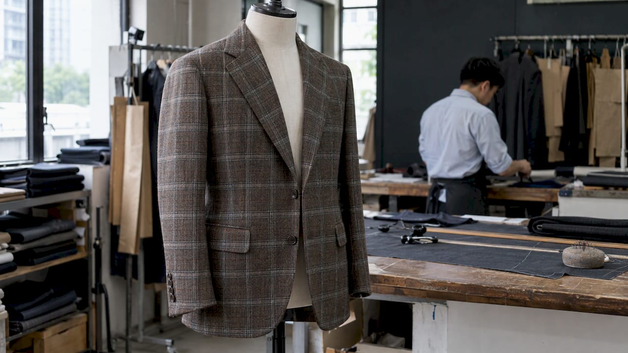
This is a matter of cutting, not of price tag alone. It takes more cloth and more planning at the cutting table, because each piece must be positioned against its neighbour before it is cut. That is one of the reasons made-to-measure tailoring suits patterned cloth so well: the pattern can be aligned for your frame, not for an average one.
For the pattern-matched shirt, the same applies at the collar, cuffs, placket and pocket. When you order custom shirts, look at these points on the finished garment.
Our perspective
We have been making suits since Richard Fan founded the house in 1979, and the lesson that has served us longest is that pattern should never be asked to do the work that fit should do.
A striped or checked cloth is unforgiving: it draws attention to every line of the body and to every seam. When the jacket sits correctly on your shoulders and the trousers fall cleanly, the pattern appears to belong to you. When the fit is off, the pattern exposes it. That is why we begin each commission with your measurements and your preferences, and why the fitting matters as much as the cloth.
Our advice to the modern gentleman is to choose one pattern and let it lead. Pair it with plain, well-cut companions, and let texture bring the rest of the interest. It is a quieter way to dress, and in our experience it is the one that endures.
Ron
Bring it to a suit made for you
Pattern matching is easiest when the suit beneath it is made for your proportions. At Ron & Rich we make bespoke suits, sports jackets, tuxedos, shirts, trousers and waistcoats using traditional tailoring techniques, with personalised fittings and premium fabrics suited to Singapore’s climate.
The published starting prices are $2,170 for suits, $1,790 for sports jackets, $2,270 for tuxedos, $199 for shirts, $290 for trousers and $380 for waistcoats. You can see them all on our pricing page. If you are building an outfit for the office, our business suits page is the place to begin.
For shirts to go with your suit, in plain or patterned cloth, see our tailor made shirts.
FAQ
Is it okay to mix patterns with a suit?
Yes, provided the patterns differ in scale and you keep to two. A pinstripe suit works with a plain shirt and a simple tie, while a plain suit can carry a patterned shirt and a bolder tie. The pieces closest together, shirt and tie, need the clearest difference in size.
How do I match a shirt and tie to a patterned suit?
Treat the suit as the leading pattern and keep the shirt plain, in white or light blue. Choose a tie that is a solid or a quiet motif in a colour already present in the suit. A dark navy tie is the safe answer for almost any suit.
Which colours are the easiest to start with?
Navy and grey. A navy suit with a grey tie, or a grey suit with a navy tie, is the classic place to begin. Dark red, green and purple follow naturally, while brighter shades need more care in the rest of the outfit.
What does pattern matching mean for a tailor?
It means aligning stripes, checks or plaids across the seams, pockets and collar of the garment, so the cloth reads as one continuous surface. It is planned at the cutting stage and is most visible on boldly patterned fabrics.
Sources
- Five tips on shirts and ties, Permanent Style
- Wool over linen: 5 tips on wearing suits in Singapore, The Straits Times
- Color & Pattern Matching For Classic Spring & Summer Outfits, Gentleman’s Gazette
- Work-Friendly Statement Jewelry: How to Wear Bold Pieces at the Office