6 Step Monogram Etiquette Checklist for Singapore Orders
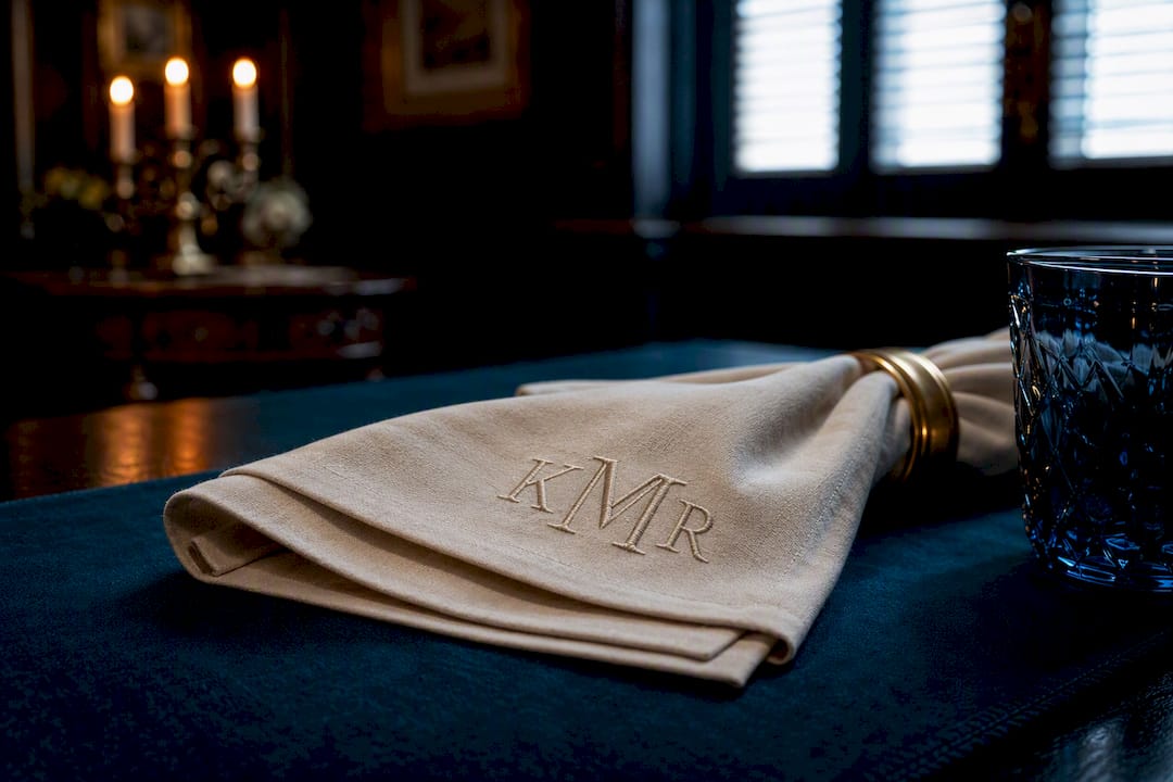
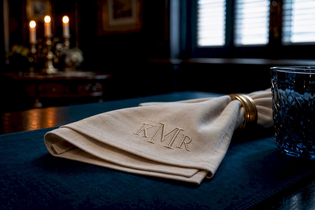
In a traditional three-letter script monogram, the center letter is always the surname and it’s larger than the two flanking initials. Block-style monograms break that rule entirely and read straight across, first name to last. Two-letter duograms and single initials are equally proper alternatives, chosen based on the item and the formality of the occasion, not as a lesser substitute.
TL;DR:
- Use script monograms with an enlarged, centered surname initial for formal linens, while block or sans-serif styles suit casual or everyday items better.
- For couples and households, follow traditional patterns: the wife’s first initial on the left, the surname initial enlarged in the center, and the husband’s first initial on the right, unless circumstances demand otherwise.
- Always preview initials in the chosen font and layout before ordering, and confirm the correct letter placement and spelling to avoid common mistakes.
- For children’s items, a single initial or simple two-letter monogram with family surname centered generally suffices, avoiding complex or formal designs.
- Monogram etiquette is flexible; prioritize matching the font style and layout to the item’s purpose and the recipient’s preferences over strict traditional rules.
Table of Contents
- What Monograms Etiquette Says About Letter Order (1, 2, 3, and 4 Letters)
- Ordering Monograms for Couples, Weddings, and Shared Households
- Choosing a Font Style That Matches the Reading Order
- Placement and Sizing Guidelines for Common Items
- Common Ordering Mistakes and a Pre-Order Checklist
- How to Order Monograms Without Guessing
- Tailoring Note From Ron & Rich: Monograms on Men’s Shirts, Cuffs and Linings
- The History Behind Monogram Etiquette
- Formal Occasions Call for Different Monograms Than Everyday Items
- Guidelines for Monogramming Children and Babies
- Gender-Specific Monogram Etiquette Considerations
- Special Cases: Professional and Academic Monograms
- Common Monogram Etiquette Myths and Misconceptions
- Tradition Still Matters, But So Does the Recipient
- Get Monogram Placement Right the First Time With Ron & Rich
- Sources
What Monograms Etiquette Says About Letter Order (1, 2, 3, and 4 Letters)
Monogram etiquette rules change depending on how many initials you’re working with, and that’s where most orders go wrong. A single-letter monogram, using just the surname initial, works well for gifts to someone whose full name you don’t know well, or for a minimalist look on shirts and leather goods. Two-letter duograms typically pair two first initials, often for couples, and read left to right with equal-sized letters.
The three-letter script monogram is the classical form, and it follows a fixed structure:
- First initial (given name) sits on the left, standard size.
- Last initial (surname) sits in the center, enlarged and often stylized.
- Middle initial sits on the right, standard size.
This center-surname convention is the single most misunderstood piece of personalized monogram guidelines. According to Lotus Linen’s ordering guide, the most common mistake buyers make is assuming a three-letter script monogram reads left to right like a name tag. It doesn’t. Four-letter monograms, used for hyphenated surnames or double middle names, generally keep the surname initial largest and centered, with the remaining three arranged around it in smaller type. When a middle name is missing, most vendors default to a two-letter monogram rather than inventing a placeholder initial.
Ordering Monograms for Couples, Weddings, and Shared Households
Married-couple monograms traditionally follow a set pattern: the wife’s first initial on the left, the shared surname initial enlarged in the center, and the husband’s first initial on the right. Vogue’s wedding etiquette guide confirms this layout for registries and household linens, and it still holds up as the default for couples who share a last name.
Modern households don’t always fit that template, though, and monogram etiquette has room for it:
- Engaged couples should avoid the shared surname before the wedding; a duogram of two first initials is the safer, more accurate choice until the marriage is official.
- Same-sex couples and couples keeping separate surnames often use a two-first-initial duogram instead of a three-letter surname-centered design.
- Blended households sometimes skip the surname format entirely and monogram with a shared word or theme instead of initials.
Pro Tip: If you’re monogramming a wedding gift and you’re not sure whether the couple is taking a shared name, a first-initial duogram is the one layout that’s never wrong.
Choosing a Font Style That Matches the Reading Order
The font you pick isn’t just decoration. It tells the eye how to read the initials, and mismatching style to order is a fast way to confuse whoever receives the gift. Interlocking script and other traditional monogramming traditions imply the center-surname hierarchy: the middle letter is bigger because the style itself signals “this one matters most.”
Block, sans-serif, or diamond-style monograms do the opposite. They present all three letters at equal size, and they’re meant to be read plainly from left to right, first name to last.
A few practical guidelines for picking between them:
- Use script and center-emphasis styles for formal linens, robes, and stationery where the enlarged surname initial reads as a design feature.
- Use block styles for casual apparel, luggage tags, and gym gear, where quick left-to-right legibility matters more than elegance.
- Always request a digital preview in the exact font you’ve chosen before finalizing. Letter proportions shift dramatically between styles, and what looks balanced in one typeface can look cramped or lopsided in another.
Placement and Sizing Guidelines for Common Items
Proper monogram placement isn’t guesswork. It follows measurements that embroidery shops and bespoke tailors use every day to keep the design centered, legible, and clear of seams. The American Sewing Guild’s monogramming reference lays out precise distances for the most commonly personalized items, and those numbers are worth copying directly into any order form.
Design size should always scale with the item and fabric weight. A monogram sized correctly for a heavy bath towel will overwhelm a linen pillowcase, and one sized for fine cotton shirting will look lost on denim.
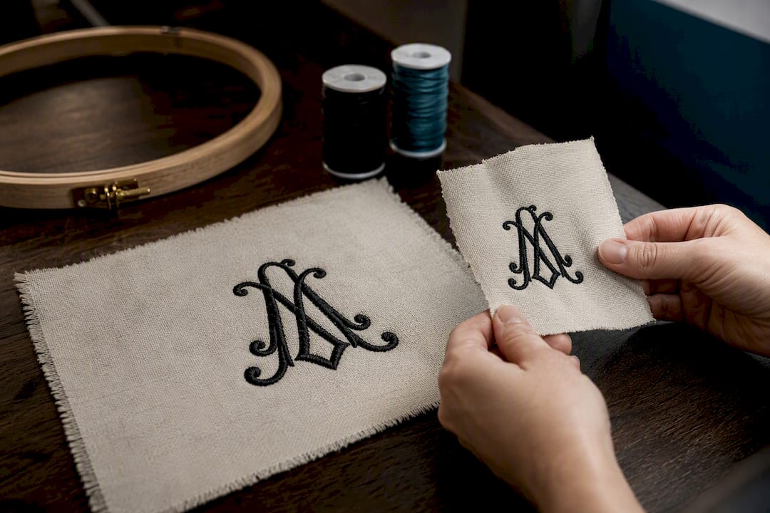
Pro Tip: Ask your embroiderer for a stitch-out sample on a fabric scrap before committing to the final size. This is the fastest way to catch a monogram that’s too dense for delicate weaves.
Common Ordering Mistakes and a Pre-Order Checklist
The mistakes that ruin monogram orders repeat themselves across every vendor: entering initials in name order instead of the correct center-surname order for script styles, guessing at a middle initial that doesn’t exist, placing the wrong letter in the enlarged center position, choosing thread colors with poor contrast against the fabric, and rushing an order without a proof.
Run through this before you submit anything:
- Confirm the spelling of every name involved, including the recipient’s legal middle name.
- Confirm which initial belongs in the center position for the chosen style.
- Preview the exact initials in the exact font you’ve selected.
- Request a stitch sample if you’re monogramming an expensive or delicate item.
- Double-check placement measurements against the item’s actual dimensions.
- Confirm turnaround time, especially for wedding or holiday deadlines.
For hyphenated or unusually long surnames, a two-letter duogram is often the safer, cleaner-looking choice than forcing a crowded four-letter design.
How to Order Monograms Without Guessing
Personalization tools vary more than most buyers expect. Some auto-reorder your initials based on the font style you pick, silently converting a name-order input into center-surname format or vice versa. The Company Store’s monogramming guide recommends treating every vendor’s preview screen as mandatory, not optional, because that’s the only reliable way to catch an auto-reorder before it ships.
A dependable workflow looks like this:
- Write down the preferred name format first: which initial is the surname, and whether a middle initial exists.
- Choose the monogram style (script, block, or decorative) based on the item and formality.
- Preview the initials in that exact style and check the letter order against your written notes.
- Request a digital mockup or physical stitch-out if the item is costly.
- Finalize only after the preview matches your intent exactly.
Pro Tip: Ask any vendor directly about stitch density, thread color range, their correction policy if a mistake ships, and turnaround time. A shop that hesitates on the correction policy is one to think twice about.
Tailoring Note From Ron & Rich: Monograms on Men’s Shirts, Cuffs and Linings
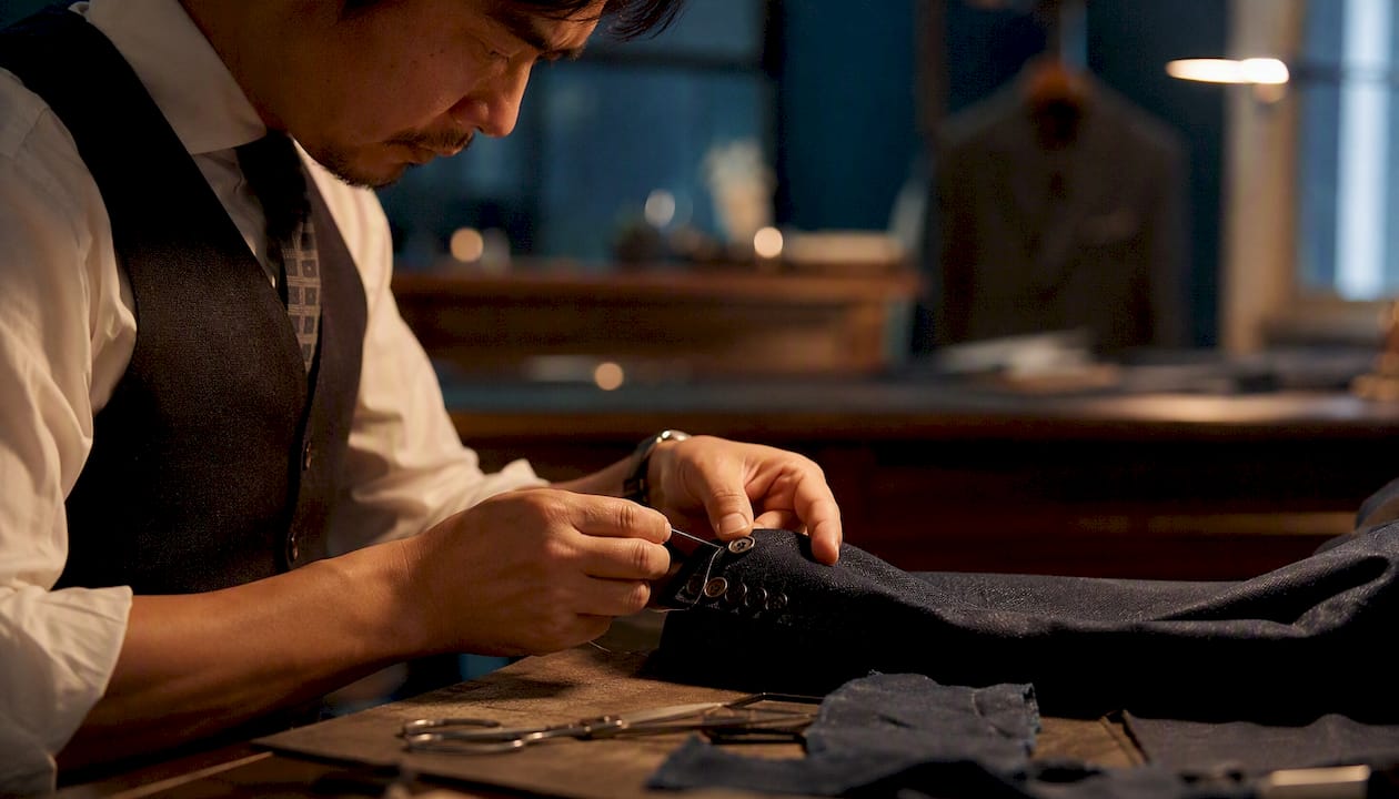
On bespoke shirting, we place cuff monograms discreetly, usually toward the buttonhole side of the French cuff or barrel cuff, where they read as a personal detail rather than a statement. Thread density has to stay light on fine cotton and linen shirting to avoid puckering the weave.
A monogram that’s beautifully placed on paper can still pucker or shift once it meets real fabric. That’s why we’d rather talk placement during your fitting than fix it after the fact.
Discussing placement while the shirt is still being built lets us account for how the fabric drapes and where the stitching sits against the seam.
The History Behind Monogram Etiquette
Monogramming traditions stretch back further than most people assume. Ancient coins bore ruler’s initials as a mark of authority, and medieval artisans and royalty used interlocking letters to stamp ownership on everything from manuscripts to armor. By the 19th century, monogramming had become a marker of household wealth in Europe and America. Hand-embroidered initials on linens signaled that a family could afford both fine fabric and the skilled labor to personalize it.
The center-surname convention in script monograms has practical roots, not just decorative ones. When embroidery was done entirely by hand, an enlarged center letter gave the eye an anchor point, a way to identify the surname at a glance even from across a formally set table or a folded stack of linens. That visual hierarchy stuck around long after machine embroidery made the process faster and more affordable.
What’s changed most isn’t the etiquette itself but who gets to use it. Monogramming was once reserved for households with means. Machine embroidery brought the price down enough that a monogrammed towel or shirt is now a routine gift rather than a luxury reserved for trousseaus and wedding chests. The rules survived that shift mostly intact, which is part of why they still feel worth following: they’re not arbitrary, they’re inherited from a system built to make initials legible at a glance.
Formal Occasions Call for Different Monograms Than Everyday Items
Monogram etiquette flexes depending on where the item will be used and who will see it. Formal contexts, wedding linens, fine stationery, heirloom silver, tend to favor the traditional three-letter script with its enlarged center surname. That layout signals permanence and occasion, which is exactly what a wedding registry or engraved gift is meant to convey.
Everyday and casual items don’t carry the same weight, and treating them with full formal etiquette often looks overdone. A gym bag, a baseball cap, or a casual linen shirt reads better with a simple block-style duogram or a single initial. The formality of the font should match the formality of the object.
Workplace and professional gifts sit somewhere in between. A monogrammed portfolio or briefcase for a colleague usually leans toward a clean, minimal block style rather than an ornate script, since the goal is polish without looking like a wedding gift arrived at the office by mistake.
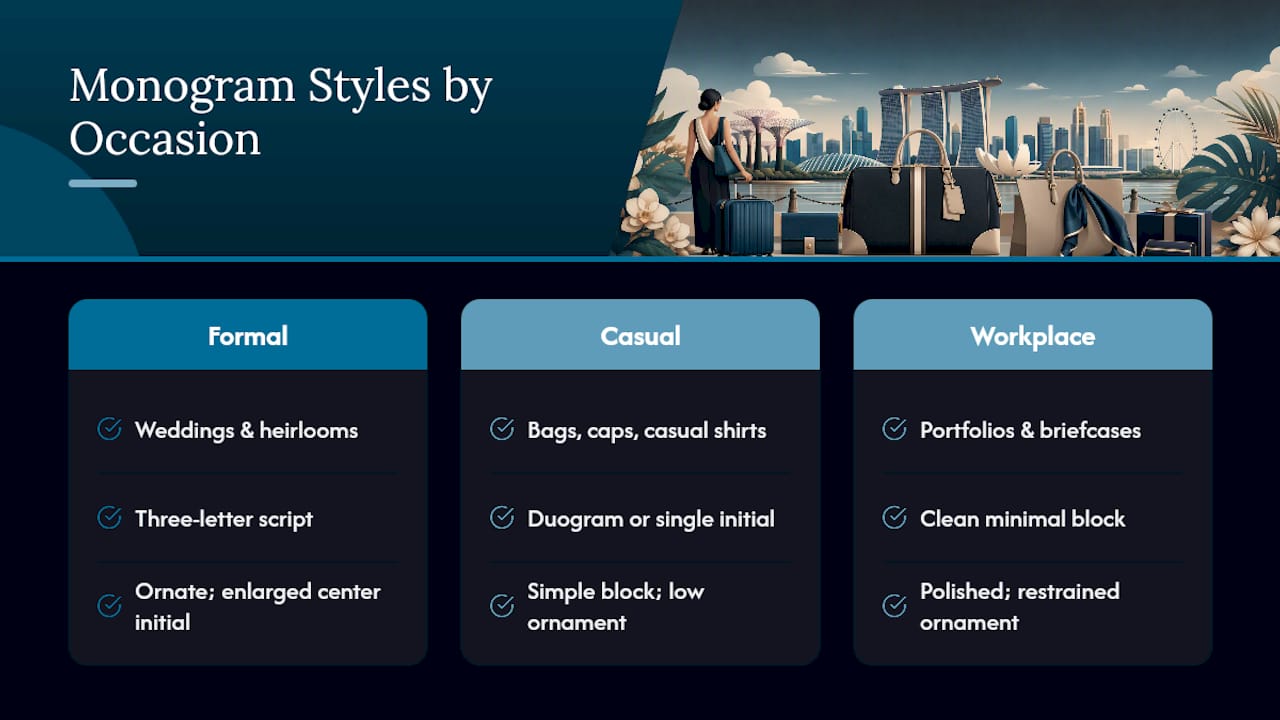
The general principle: match the monogram’s formality to the item’s role, not to a fixed rule about what “proper” monogramming always requires. A silk pocket square for a black-tie event and a canvas tote for a weekend trip don’t need to follow the same conventions, and forcing them to usually looks like a mismatch rather than an upgrade.
Guidelines for Monogramming Children and Babies
Monograms for children and babies follow looser rules than adult etiquette, mostly because the goal is identification and sentimentality rather than formal presentation. A baby blanket, bib, or onesie typically carries a single initial or a simple two-letter combination, first initial paired with last, in a soft, rounded font rather than the sharper serif styles common on adult linens.
Full names spelled out in block letters are common on children’s items, especially for daycare or school gear where quick identification matters more than elegance. This is one of the few contexts where spelling out a full first name, rather than using initials, is considered perfectly appropriate.
For a christening gown, baby blanket, or other keepsake meant to last decades, a classic three-letter script monogram with the surname centered works well and ages gracefully as the child grows. The same center-surname rule applies here as it does for adult items: the family name stays enlarged in the middle.
One practical note worth flagging: avoid ordering a monogram based on a middle name that hasn’t been finalized yet. Family middle-name traditions and last-minute name changes are common enough that vendors report a steady trickle of correction requests tied to premature birth-announcement orders.
Gender-Specific Monogram Etiquette Considerations
Monogram etiquette historically included gendered conventions, and some of them still show up in retail guidance today. Traditionally, women’s monograms have leaned toward script styles with more ornamentation, while men’s monograms defaulted to block letters or simpler serif styles with less flourish. That distinction was never a hard rule so much as a marketing convention that retailers reinforced over decades.
In practice, the letter order itself doesn’t change based on gender. A man’s three-letter script monogram follows the same center-surname convention as a woman’s. What tends to differ is stylistic: men’s monograms on shirts, cufflinks, and leather goods usually favor minimal block or thin serif fonts, sized smaller and placed more discreetly, while women’s monograms on linens, jewelry, and stationery have historically allowed for larger, more decorative scripts.
These conventions are loosening. Plenty of men now choose ornate script monograms for personal stationery or leather goods, and plenty of women choose clean block letters for luggage or tech accessories. The etiquette rule that actually matters isn’t about gender at all: it’s about matching the font’s formality to the item and the wearer’s personal taste, not defaulting to a decades-old assumption about what “looks masculine” or “looks feminine.”
Special Cases: Professional and Academic Monograms
Professional and academic contexts introduce a few personalized monogram guidelines that don’t come up in everyday gifting. Academic monograms, common on graduation gifts like portfolios, pens, or briefcases, sometimes incorporate a graduation year or degree abbreviation alongside the initials, though the core initial order still follows standard convention.
For professional gifts, like a monogrammed leather bag for a new hire or a retirement gift for a longtime colleague, the safer choice is almost always a simple two- or three-letter monogram without decorative flourishes. Ornate script can look out of place in a corporate setting, while a clean block or thin serif style reads as polished without overstating the occasion.
Titles and credentials (Dr., Esq., professional designations) are not typically included in a monogram itself. They’re reserved for formal correspondence and engraved nameplates, not embroidered initials. Mixing a title into a monogram design is one of the more common overcorrections people make when trying to signal professional achievement through a personalized gift.
For law firm partners, medical professionals, or executives receiving monogrammed desk accessories, a subdued, single-color thread in a neutral tone (navy, black, deep gray) tends to age better than a bold or contrasting color choice that can look dated within a few years.
Common Monogram Etiquette Myths and Misconceptions
The biggest misconception in monograms etiquette, by a wide margin, is the belief that a three-letter monogram always reads in name order, first, middle, last, left to right. As covered earlier, that’s true for block styles but false for traditional script, where the surname sits enlarged in the center regardless of which name comes first alphabetically or chronologically.
A second common myth: that monogramming is inherently formal and reserved for weddings, heirlooms, and fine linens. Retailers and etiquette writers increasingly push back on this idea, noting that personalization practices have expanded well beyond formal gifting into everyday items like tote bags, water bottles, and casual apparel, where the rules are far more relaxed.
Third myth: that etiquette rules are fixed and universal across every vendor. In practice, font-driven auto-reordering varies by personalization platform, and what one online tool assumes about letter order, another may handle completely differently. Treating etiquette as a strict, uniform code rather than a flexible tradition is exactly what leads buyers to skip the preview step and submit an order they haven’t actually verified.
Finally, some buyers assume a monogram must include exactly three initials to look “proper.” Two-letter duograms and single initials are equally legitimate choices, and forcing a three-letter format onto someone without a middle name (or without wanting one used) usually produces a more awkward result than a clean two-letter alternative would.
Tradition Still Matters, But So Does the Recipient
Monogram etiquette earns its keep because it solves a real problem: making initials legible and meaningful at a glance. That’s worth respecting. But etiquette was always a guideline shaped by tradition, not an unbending law, and modern households, gift-givers, and stylistic preferences deserve room inside it. Run the pre-order checklist, preview your font choice, and trust your own judgment about what fits the recipient.
Ron
Get Monogram Placement Right the First Time With Ron & Rich
Online previews and stitch samples solve most monogram mistakes, but they still leave you guessing at how a design will actually sit against real fabric. Ronandrich handles that differently: our fittings put the placement decision in front of you and your tailor at the same time, on the actual garment, before a single stitch goes in. Book a consultation and we’ll walk through cuff placement, thread weight, and stitch density together, then confirm with a placement mockup and stitch sample before anything is finalized.

Whether you’re commissioning a shirt with a discreet cuff monogram or a full bespoke suit for a wedding, our custom tailored shirts and bespoke tailoring process both build personalization into the fitting itself rather than bolting it on afterward. If you’d rather see finished pieces first, browse our suits and jackets to get a sense of the craftsmanship your monogram will sit alongside. Start with a consultation and bring your preferred initials, we’ll handle the rest in person.
Sources
The placement measurements throughout this guide come from the American Sewing Guild’s monogramming reference, a standard resource for embroiderers. Ordering conventions and the center-surname rule draw on Lotus Linen’s monogram guide and The Company Store’s personalization guide, while wedding and couple conventions follow Vogue’s registry etiquette coverage. For broader gifting context, Naise’s guide to personalizing luxury gifts offers additional retail perspective on matching monograms to formality.
- Creating a Monogram | ASG
- How to Order a Monogram, Initials, Etiquette & Placement Guide | Lotus Linen
- Monogram etiquette for weddings | Vogue
- How to Monogram: The Complete Guide | The Company Store